TuMedytuj
A meditation written for one situation.
TuMedytuj creates a meditation, both the text and the voice, for the situation someone is in right now. Not another generic recording from YouTube. It's the first tool like this in Polish that I've come across.
I built it myself in about two weeks, from September 7 to 19, 2026. It's a single-page app with the meditation tool built in, deliberately without user accounts or a separate SaaS back end. It runs on its own domain, tumedytuj.pl.
- Role
- Product design and front-end
- Time
- About two weeks
- Stack
- Next.js, Claude, ElevenLabs
- Status
- Live at tumedytuj.pl
Starting point
The cost of one session isn't fixed.
That changed everything before I designed the first screen.
I didn't start with the interface but with a question that turned out to be the most important decision in the whole project: how much does it actually cost to create one meditation, and can that be covered by the model everyone in this category uses?
Competitors run on a pure subscription: a fixed monthly fee for access. At first I went the same way, until I worked out what one meditation really costs.
The cost of voice synthesis grows linearly with the length of the recording, because ElevenLabs bills per character. With a “subscription = unlimited access” model you can't calculate the margin in advance, because a handful of very active users can eat up the profit made by everyone else.
When the cost of a single use varies a lot, around 8% of users can account for around 61% of costs in a subscription model.
I found an article by Freemius from the same month that confirmed it. This wasn't “sales could be better”. It was a concrete, calculable cost that had to shape the product's architecture before I started designing anything visual.
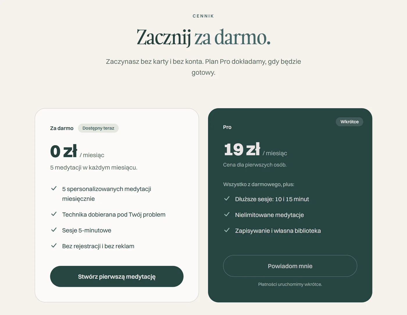
“Unlimited meditations” for a fixed price, with a cost that grows with every minute of recording.
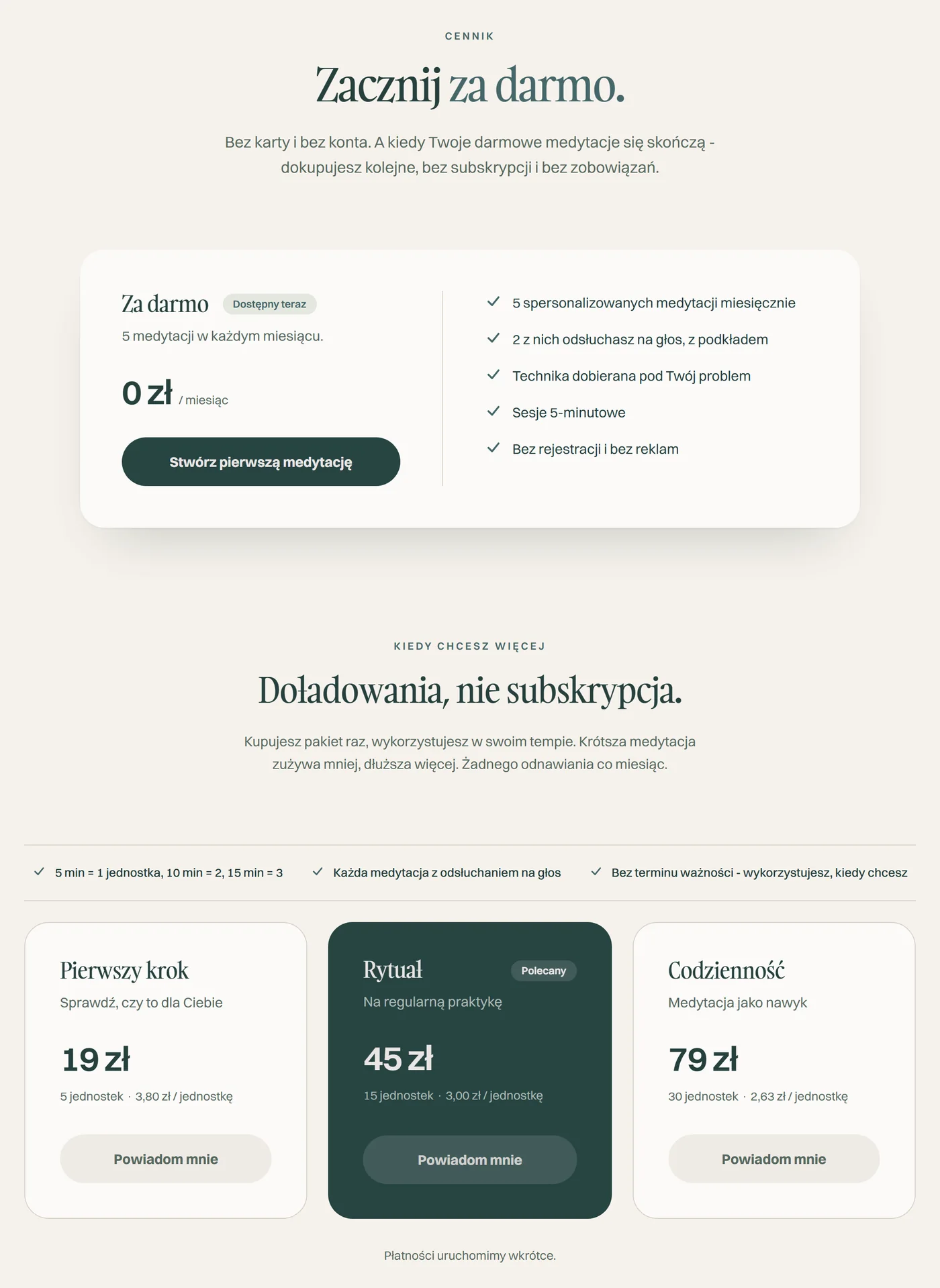
5 minutes is one unit, 10 minutes two, 15 minutes three. A shorter meditation uses less, a longer one more.
The left frame is the site from commit
d722498 (September 8, 2026, 11:29 pm), restored from git history and run locally.
The right one is the live site from October 6, 2026. Payments aren't live yet in either version.
I switched the model to top-ups. During the build I refined it once more: instead of counting every meditation the same, I moved to units based on the length of the recording. That one decision forced changes in at least five places on the site. I wrote up each of them separately, with a reason, not in bulk.
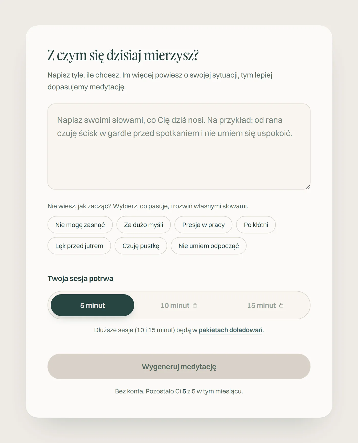
- 01Session length control
- 02Pricing
- 03FAQ
- 04Hero
- 05Form microcopy
Diagnosis
The site promised honesty.
In four places, it didn't deliver.
Before anyone noticed, I audited the content of the whole site against what the code actually did. I found four mismatches at once. The FAQ promised five free meditations a month “with no asterisks and no catches”, next to an undisclosed limit of two audio plays. The hero promised a choice of session length that the free plan didn't offer. The pricing didn't mention a feature that already existed. And the paid packs advertised a choice of voice that was actually free for everyone, a leftover from a plan I had dropped earlier.
To me this was a more serious problem than an average-looking site. The site openly declared transparency as a brand value, and in four places promised something the product didn't deliver. I fixed it not because someone reported it, but because declared honesty stops being true without regular audits of the code.
A promised choice the free plan didn't offer


“No asterisks” next to an unmentioned limit


A free plan missing a feature that already existed
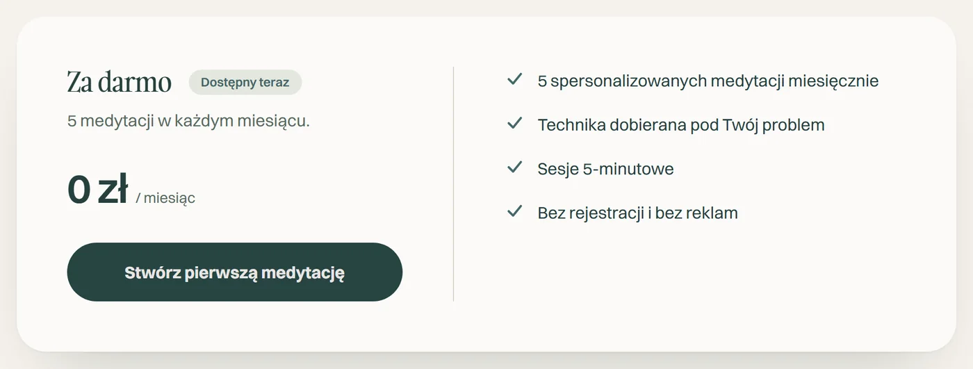
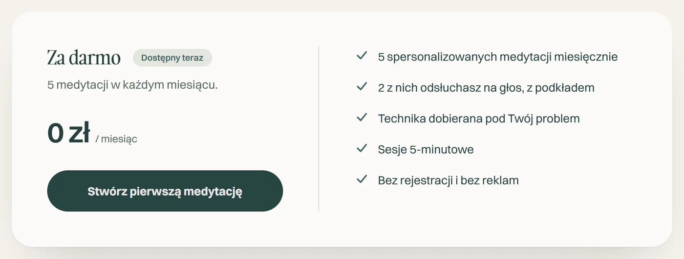
A paid feature that was free
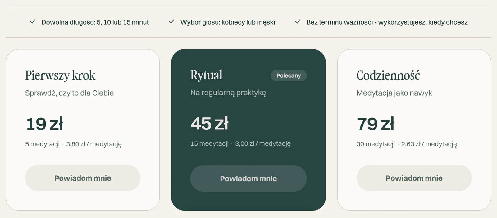
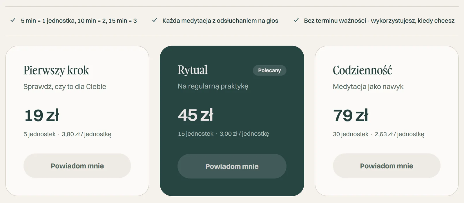
The “before the audit” state is the site
from commit 68488d2 (September 9, 2026, 1:40 pm), restored from git history. I closed all
four mismatches in one commit on September 9 at 2:21 pm, together with the move to units.
Honesty as a product feature, not a slogan on the site.
From this diagnosis I drew a rule I came back to with every later decision: honesty should be something the product does, not something it says about itself. I rejected fabricated social proof: zero testimonials, media logos or made-up user counts. For a small product, I built authenticity differently than with the standard set of growth patterns.
The bar of shared features above the pricing first had a tile with a filled background.
I rejected that version because I recognized in it exactly the template AI-SaaS look that my
own design-system.md tells me to avoid, and kept the thin lines the rest of the
site is built on.
-
Analytics consent
A banner that really asks
If you decline, the Vercel Analytics script doesn't load at all, rather than just stopping data collection. Both buttons, accept and decline, carry the same visual weight, because I called a smaller or hidden decline button what it is, a dark pattern, not a matter of hierarchy.

-
Session length
A statement instead of a question
I labeled the session length control with the statement “Your session will last” rather than the question “How much time do you have?”, because a question the product can't honestly answer with a choice reads like a promise.
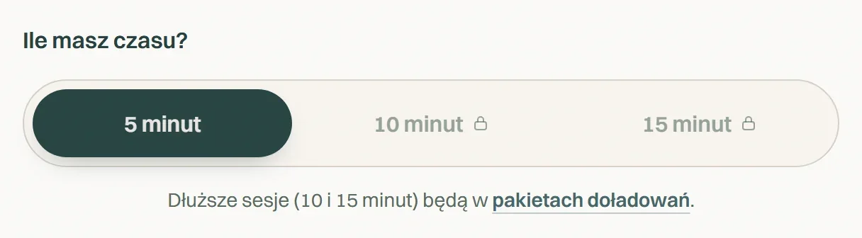
Before 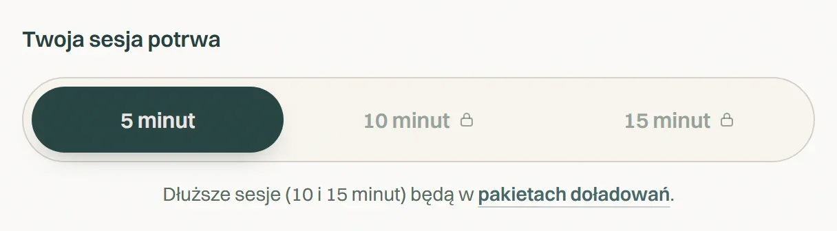
Today -
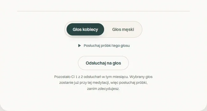
Voice choice
The limit sits where the decision is made
When choosing a voice, the site says how many plays are left and that the choice is final, before anyone clicks. It's the same limit that was missing from the FAQ before the audit.
Method
Measure, don't guess.
The same sentence came back with every decision.
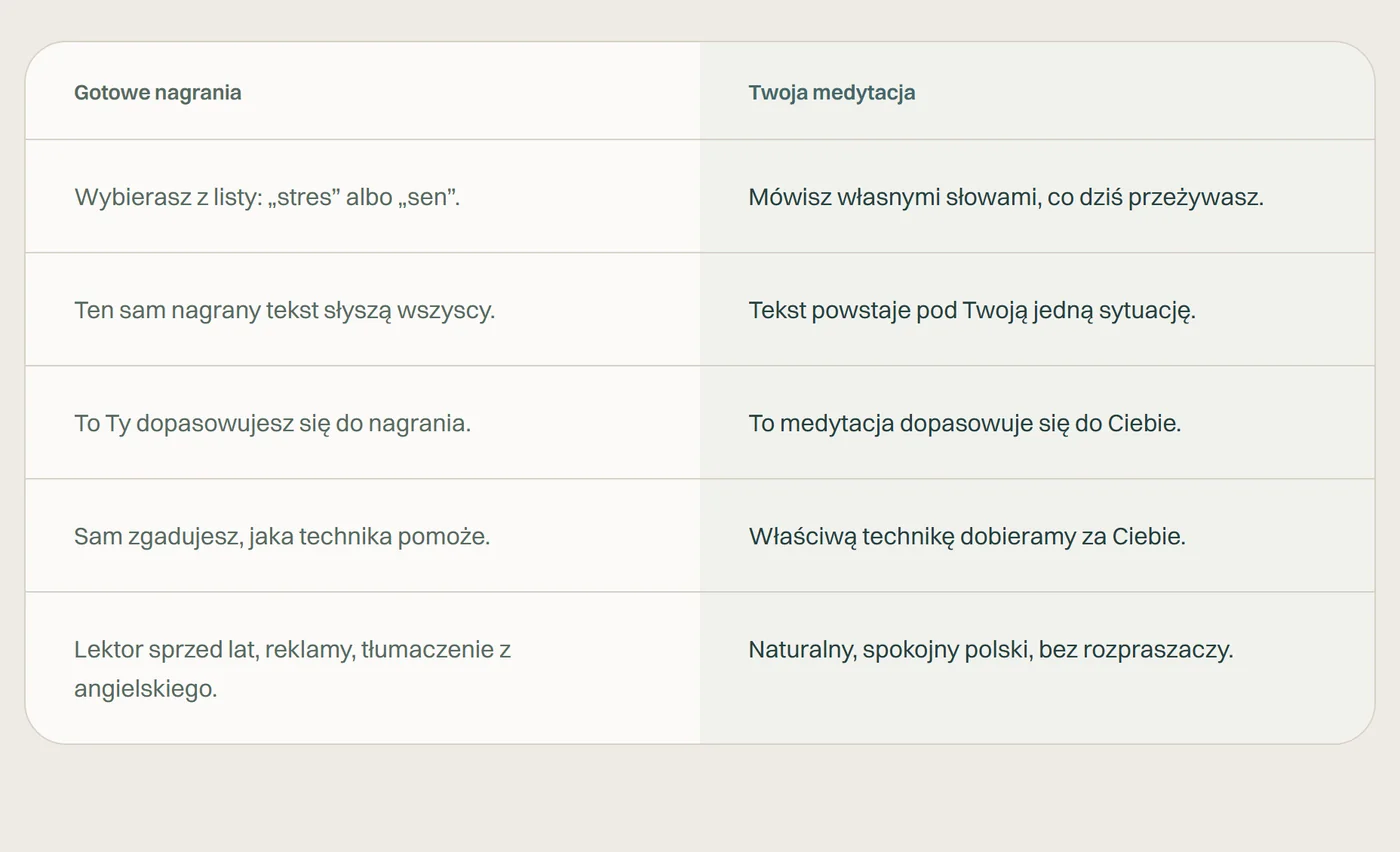
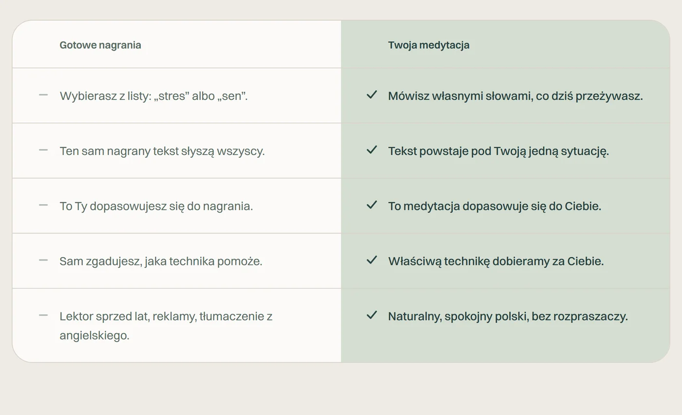
This pattern runs through the whole changelog, not just the voice or the pricing. I measured the color contrast of the highlighted column in the comparison table and got 1.07:1, at the edge of what's visible. I raised it to 1.32:1 with a new color token, not by changing opacity.
The decorative graphics in the section backgrounds had a fixed width in pixels, so on narrower screens they almost disappeared and on wider ones they overlapped the text by up to 30 pixels. I switched them to relative units so the visible part of the decoration stays the same regardless of window width.
- Highlighted column contrast
- 1.07 → 1.32:1
- Measured against the card background, before and after the new token.
- Decoration overlapping text
- 30 → 0 px
- Checked at window widths of 1280, 1440 and 1920 px.
The same rule covered the voice. When I tried to speed up the pace with a playback parameter instead of in synthesis, the result sounded noticeably stretched, even though technically it was supposed to preserve pitch. I wrote it down as a rule in the code:
Pace belongs to synthesis, not to playback, even if playback seems cheaper.
I didn't trust a single measurement either. With unusual parameter values I measured several times, because one outlier almost made it into production as the final decision.
Bug
The meditation cut off on just one iPhone.
A tester reported that the recording ended after 20–33 seconds, even though the text and the credit limit pointed to a full session. The bug didn't show up on computers or on other phones.
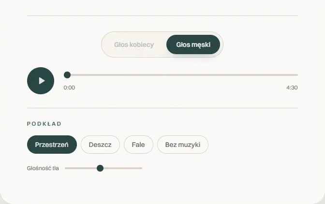
The cause was anything but obvious. Every audio file from ElevenLabs carries an MP3 header declaring the length of the recording. I was joining audio segments byte by byte, so the finished file started with a header describing only the length of the first segment, usually exactly the 20–33 seconds of the opening sentence. Chrome ignores that header and calculates the length from the file size. Safari trusts it and stops playback exactly where the header says.
Ignores the header, calculates the length from the file size and plays to the end. That's why there was no bug on any computer.
Trusts the header and stops playback where it says. On the iPhone, the meditation cut off after the first sentence.
I wrote my own parser from scratch that strips these headers from every segment before joining. But something else taught me the most: I already had the same rule in my code. I had deliberately created the silence file inserted between segments without any metadata. I applied the rule to my own file, but not to the files coming in from outside.
After the fix, the tester saw the full 4:47 in the player instead of a few dozen seconds. And she immediately ran into the second layer of the same problem: where the segments met, the voice stalled, and the background music kept playing endlessly over silence.
Background music playing over silence is worse than an honest error message.
I added a stall detector that first tries to skip the faulty fragment inaudibly and, after a few failed attempts, stops playback with a message instead of pretending everything is still playing. After both fixes, I listened to a whole meditation on my own iPhone.
Result
What's ready, and what I deliberately set aside.
The whole tool works: the user describes their situation, gets the meditation text, chooses a voice after hearing a sample, can add background music matched to the mood, and plays it all in my own player, consistent with the rest of the visual system.
The site also has a safety path. If what the user typed points to a crisis, I show a separate, calm screen with clickable support numbers instead of continuing with the meditation.
-
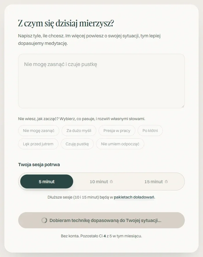
Your own words instead of a list of categories
Someone describes what they're dealing with today, and the tool picks a technique to match.
-
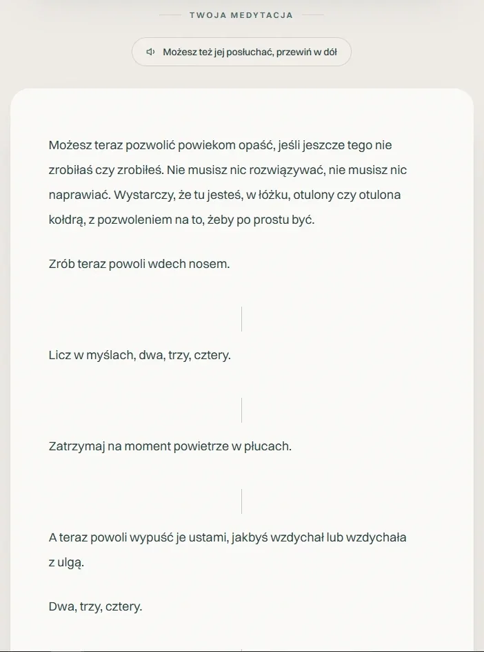
Text written for that one situation
The meditation responds to what was typed: the bed, the duvet, sleep. The vertical bars in the text are pauses you later hear in the recording.
-
A voice with a sample, background music and the player
I showed the voice choice with its disclosed limit in the audit, and the player in the iPhone bug.
Over the whole build and testing period, 1.83 hours of recordings were made for 35.6 thousand ElevenLabs credits. That's the project's main cost, because the text written by Claude cost pennies. Visit statistics showed 26 people, but only those who clicked consent. The rest, just as I designed it, left no trace.
- Recordings
- 1.83 h
- The whole build and testing period, my own tests included.
- Voice cost
- 35.6k
- ElevenLabs credits, dashboard from October 5, 2026.
- Testers
- ~10
- Family and friends. A number from memory, not measured.
- Visitors
- 26
- Only those who agreed to statistics.
I left user accounts and a real checkout outside the MVP, because they need separate payment infrastructure that I want to build only once I have real cost data from production, not assumptions.
For the same reason, search engine indexing is blocked for now: random traffic from Google shouldn't eat paid credits before the product makes money. These are deliberate decisions, documented with reasons, not oversights.
A small design system in Figma
For TuMedytuj I built a design system: variables, text styles, colors and components with variants. I made it in Figma and used AI to hook up the variables, styles, colors and text.
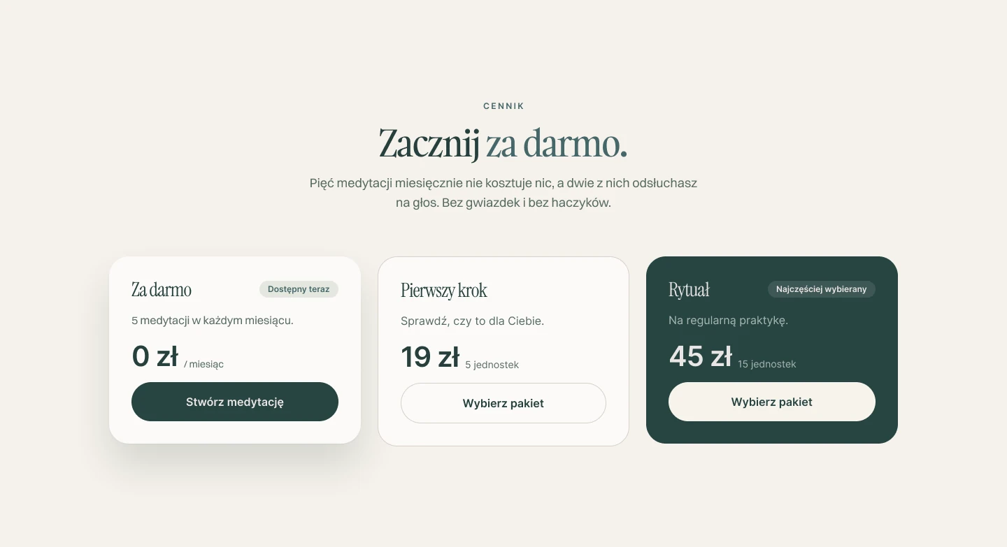
Token names and values match the site's code. The pricing on the Demo page is assembled from the same components, with the same packs and prices as on tumedytuj.pl.
See the file in FigmaFor each section of the file I wrote down why I did it this way and not another. Three examples:
-
Color
I started with the question of who comes here: someone in the evening, tired, who wants a moment of quiet. That's why the main color is a deep green, not blue, which feels like a bank or a work app.
-
Type
I know a serif heading with sans-serif body text is now a layout associated with sites made by AI. I kept it because here it has a specific job.
-
Cards
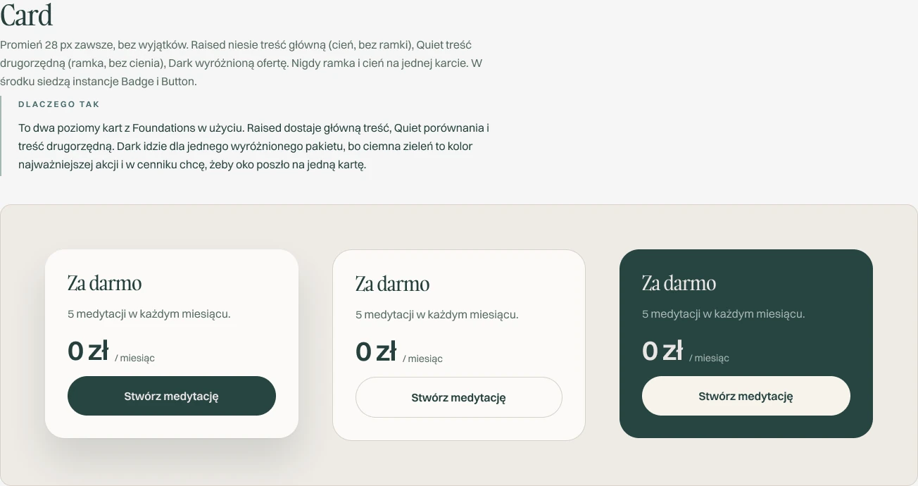
Only primary content gets a shadow, secondary content gets a border, and never both at once. If everything had a shadow, nothing would stand out.
Takeaway
What stays with me most is the method, not the app itself.
I wrote the code with the help of Claude Code. Beyond the interface itself, I put the most work
into making sure the project didn't lose its memory. I updated changelog.md and
design-system.md after every change, with the reason “why”, not just “what”. That let
me come back to the project after a break, and decisions from a few days earlier didn't get lost
in the next session. Keeping that documentation was as important a part of the work for
me as the interface itself.
That's the method: measure instead of guessing, audit my own promises against the code, and keep documentation precise enough to work with AI step by step without losing the product's consistency.
I can repeat this method in my next project. The interface stays with this one.