A paid platform for a site that didn't use it
The Basic plan at $14 a month, billed annually: $168 every year for features a static site never used.
SensoBaza
I redesigned the website of a children's therapy center. The client's cost for a platform she didn't need dropped to zero, and the site now earns trust with the real place instead of a stock photo.
Starting point
I made SensoBaza pro bono, alongside my studies. It put the new center on the web and gave the brand its own voice. I prepared the direction in Figma Slides and, once the client approved it, built the site in Webflow.
When I came back to it a year later, I didn't want to redo everything just because I could now make something flashier. I had to separate what really needed to change from what had already earned its place: the URLs, the tone, the contact details and the recognizable green.
Diagnosis
It all started with the platform's upcoming renewal date. The site was effectively static, didn't use a CMS and, apart from the form, used nothing the client was paying for every year. The bill also brought a second, less visible cost to light.
The Basic plan at $14 a month, billed annually: $168 every year for features a static site never used.
The content was all there, but the order didn't lead to a decision.
New rule: technology has to justify its cost, and the hierarchy has to answer the question a parent asks first.
Before and after
I kept the message, the logo, the green and the main contact path. I didn't pretend the brand needed a revolution. What I changed was how the site proves there are a real place and real people behind the address.
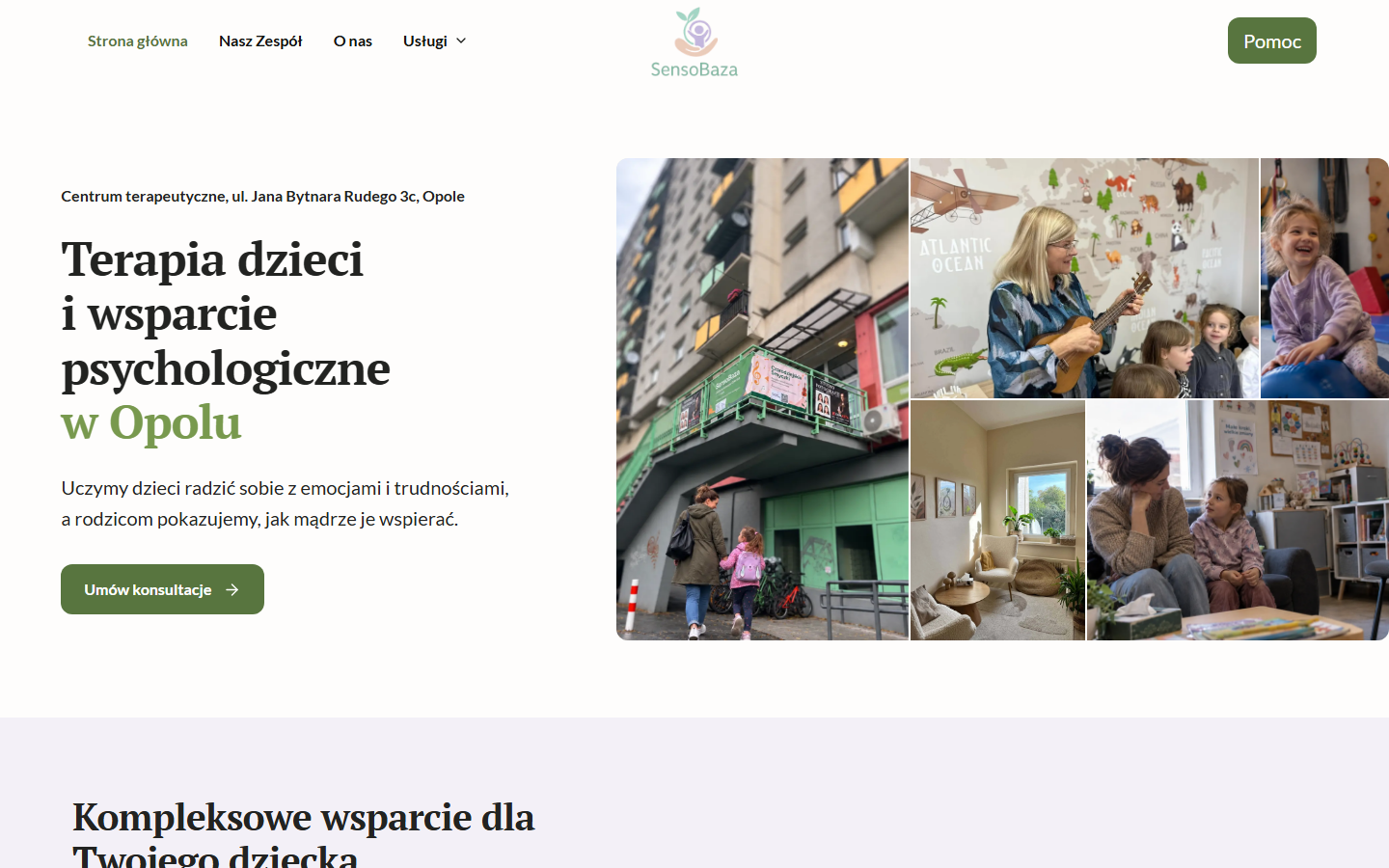
Five pairs of full-page screenshots, taken on September 22, 2026 at a width of 1440 px. Pick a page and scroll the frame: you'll go through both versions, from header to footer, at the same scale. The website itself is in Polish.
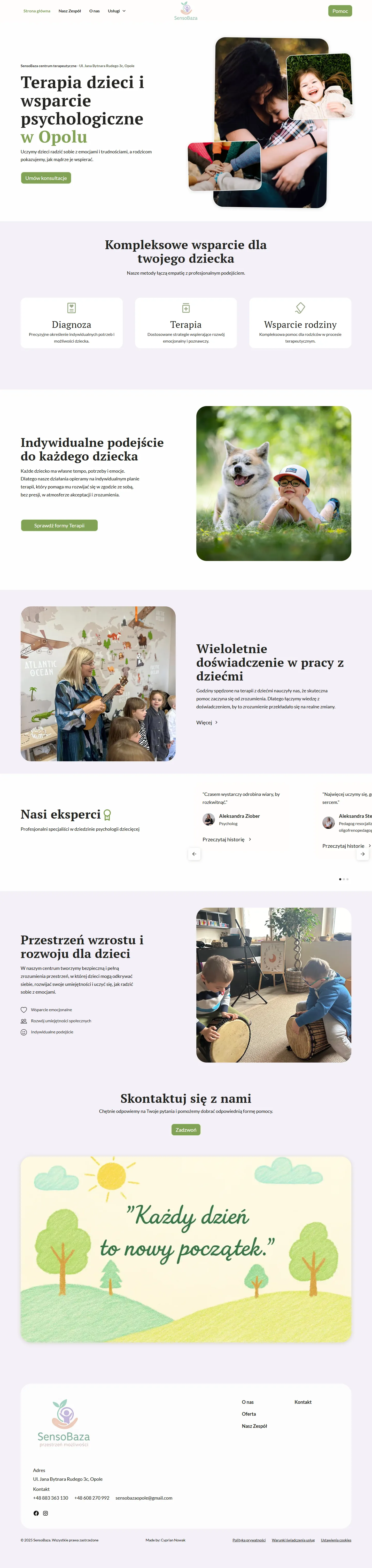
Three overlapping stock photos suggested care, but didn't show this place.
Open screenshot in a new tab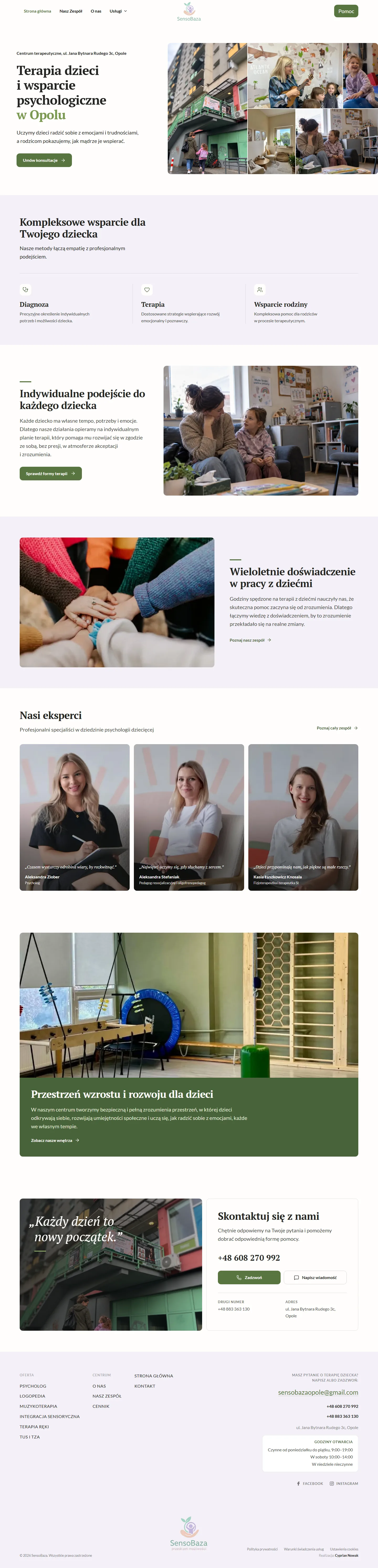
The entrance, the space, the therapists and the activities come together as one whole instead of three separate decorations.
Open screenshot in a new tabThe brand stayed the same. What changed is how the site proves there's a real place behind the address.

A full-frame stock photo, a heading on top of the image and one generic call to action: get in touch.
Open screenshot in a new tab
Five forms of therapy named in the lead, the phone number and price list as separate exits, and the address and team visible without scrolling.
Open screenshot in a new tabA parent doesn't ask whether it's nice. They ask whether the center has what they need, how much it costs and how to book. The old services page is also over a quarter longer than the new one (10,743 px vs 8,441 px), with fewer specifics.
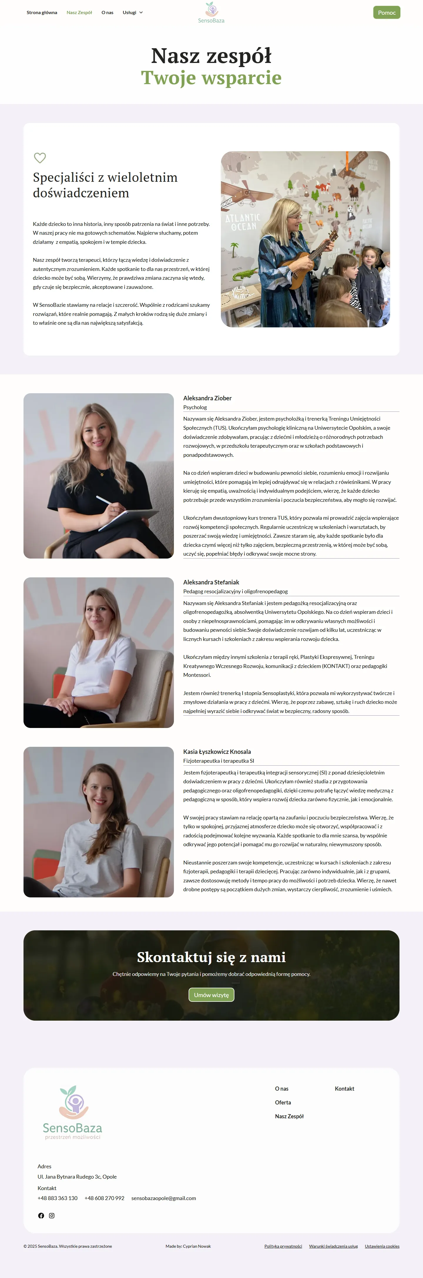
A heading, an empty band, then a card with a heart icon. You have to scroll to reach the first paragraph about the people.
Open screenshot in a new tab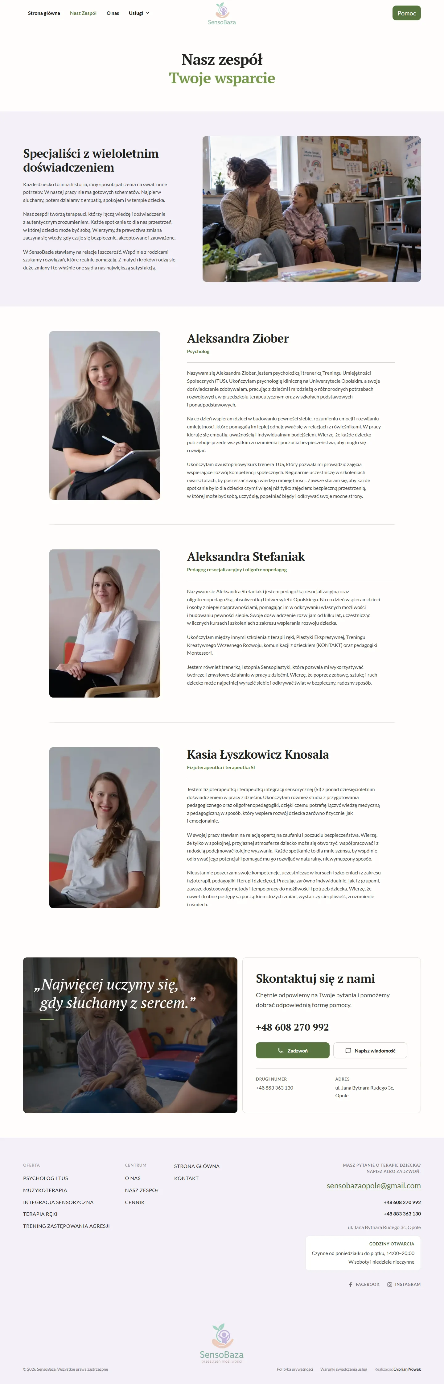
No card, no icon. Three paragraphs and a photo from a therapy room fit in the first frame.
Open screenshot in a new tabThe text is the same. What's gone is the frame that pushed it below the first screen.
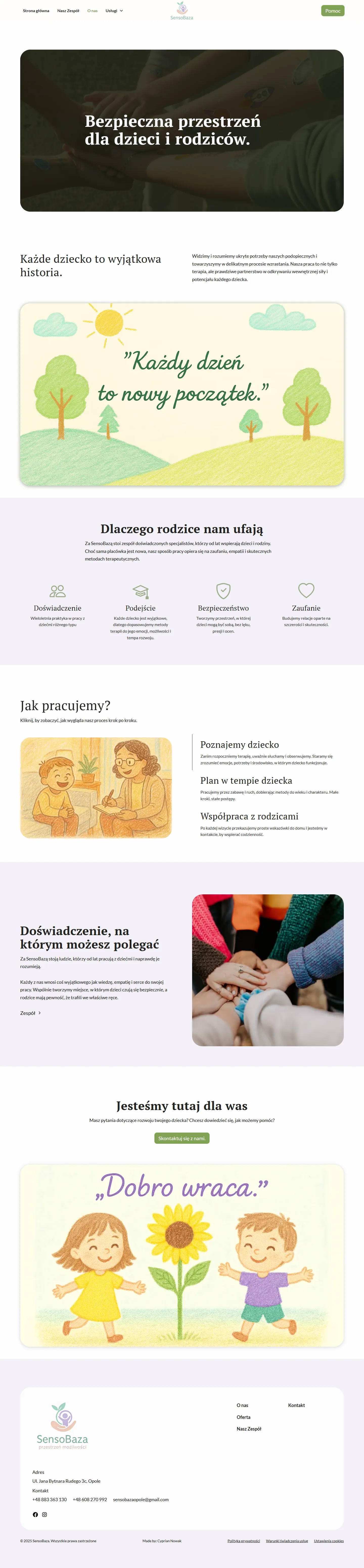
A full-frame photo and a sentence about a safe space. Apart from that, the first frame has no information at all.
Open screenshot in a new tab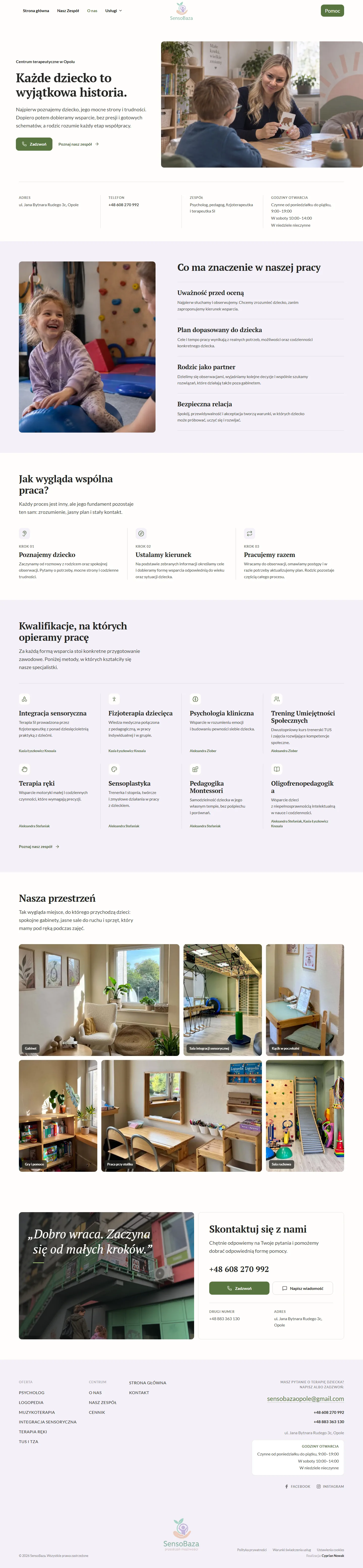
A description of how the center works instead of a promise, the address, phone number, team and opening hours, and below them six captioned photos of the therapy rooms where the child will actually spend time.
Open screenshot in a new tab“A safe space” is a sentence anyone can write. Opening hours and who's on the team are things a parent can check.
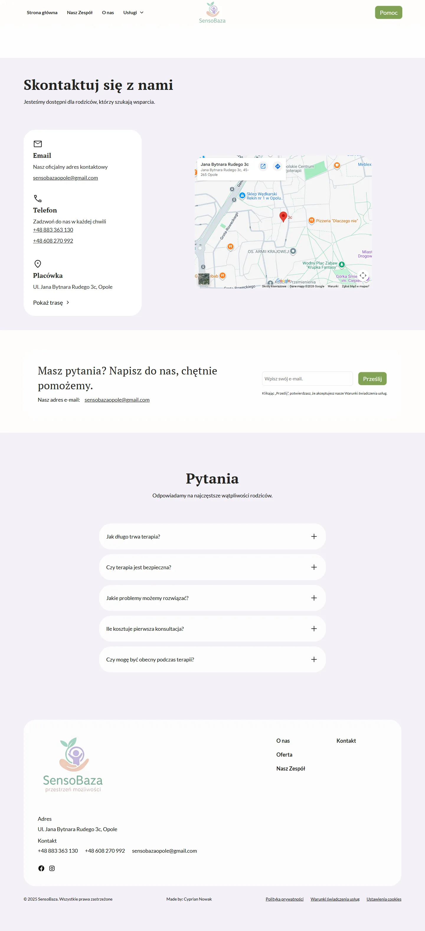
The contact card opens with the email address, and the phone numbers sit below it as just another list item.
Open screenshot in a new tab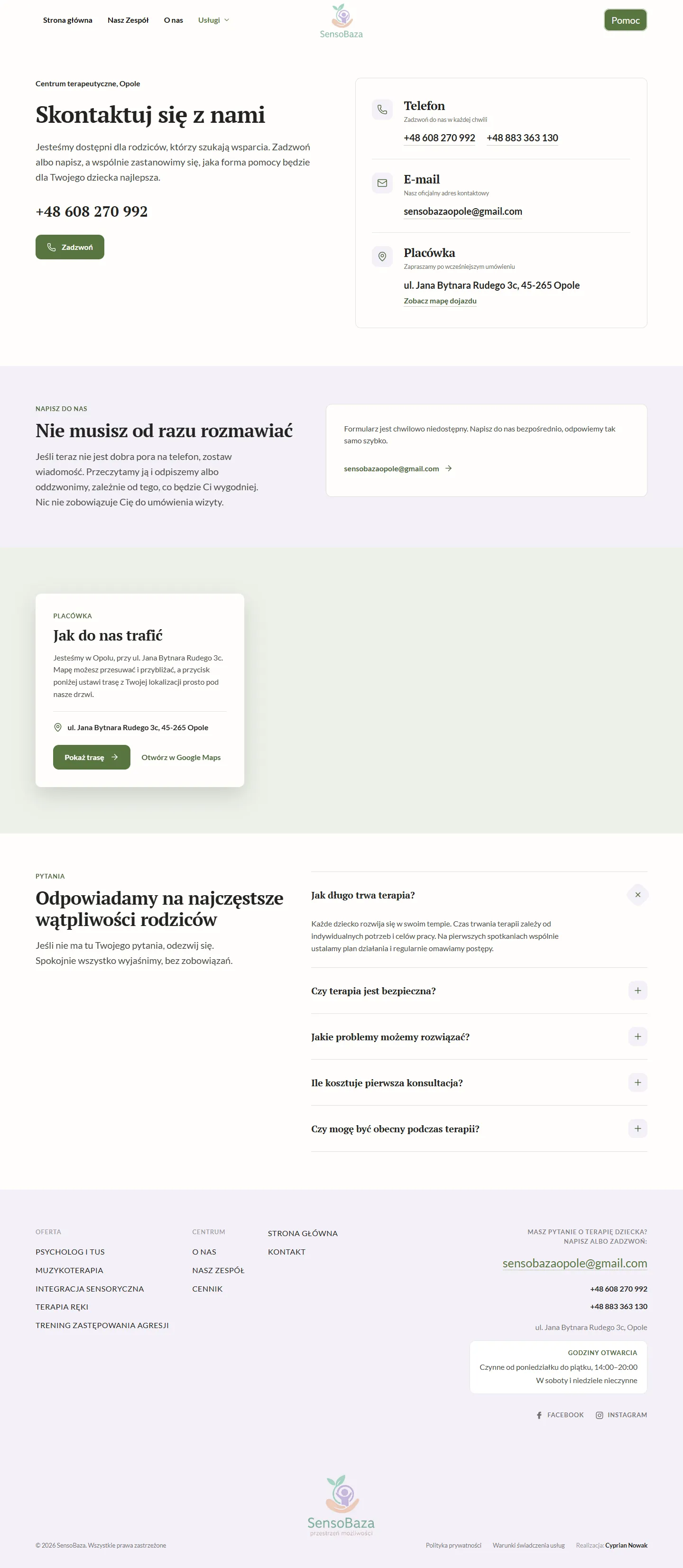
The number set apart with a Call button, and a card beside it that organizes the phone, email and the center's address.
Open screenshot in a new tabA worried parent calls rather than writes. The order of the contact options was meant to reflect that.
Authenticity. Stock photos gave way to photos from the client.
Composition. Rounded cards with shadows gave way to a flat, static mosaic.
Brand core. The green #5D7F45 and the lavender #F3F0F7 stayed untouched. They're the client's colors, not mine.
Information architecture
A parent looking for support for their child isn't browsing a service catalog. They may not know the names of therapies, and they may be under pressure. That's why the sections follow the order of the parent's questions, not the center's offer.
First, a clear picture of what the center helps with, in words without clinical distance.
The team and real photos appear before the form, not after it.
Phone, email, prices and the form are equal paths. Contact doesn't hide behind a form.
A parent who lands here has a real problem to solve for their child, not time to admire the interface. That's why the content comes first: no animation that doesn't help find an answer faster.
A system, not styling
SensoBaza was meant to look warm but not childish, professional but not clinical. That line is hard to keep in your head over three days of work, so I wrote it down as named rules. That way they were clear to the tools working on the code, too.
A warm background carries the whole page. Pure white has a specific job; it isn't the default.
Text sizes and spacing come from a scale, not from one-off tweaks by eye.
The same section format can't appear three times in a row. The rhythm changes, not the system.
Iteration
The redesign didn't land on the first try. The most important fixes weren't flashy: they came from looking at the finished interface again.
The first version of the mosaic used placeholder images. When the client sent real photos of the center, I swapped them in without rebuilding the composition. It turned out the layout didn't depend on one perfect image.
At first I left them next to the address so another heading wouldn't compete with the footer's hierarchy. I had a good reason for that. When I looked at the page again, I saw that the information was getting lost, so I added a separate panel.
The active page state didn't match between the desktop navigation, the mobile menu and
the services dropdown. Instead of patching each case separately, I unified
aria-current and the visual state across all three.
The build is part of UX
The new site is static HTML. The content works without JavaScript, and scripts are used only where they're really needed. Speed, stability and the risk of losing Google rankings shape a parent's experience as much as the layout of the first screen.
aria-currentprefers-reduced-motionResult
Parents of our patients very often tell me that the website captures the atmosphere of SensoBaza perfectly. They're impressed by how intuitive it is and by how faithfully it shows the place and the therapy rooms, and the therapists too.
As for changes, parents definitely use the map: instead of asking how to find us, they plan their route straight from the website. We get fewer questions on Messenger and by email about prices, services and availability, because everything is clear on the site.
Aleksandra Ziober, director of SensoBaza (translated from Polish)
The new SensoBaza has been live at the client's address since September 25, 2026, sensobaza-opole.pl. The old page addresses lead to the new pages, and the paid Webflow plan won't be renewed.
The director's words are an observation from the center's daily work, not a measurement. It's still too early for numbers, which is why I don't report a conversion lift or search rankings as a result. Once the site has been running longer, I'll check phone and email clicks, submitted forms, visibility in Search Console and Core Web Vitals.
Takeaway
It shows how my work has changed: from a first website made while I was still at university to a project where design, code and responsibility for upkeep go together.
AI sped up the execution, but I was the one who worked through the problem, talked to the client, and I'm the one responsible for the migration. The tool worked to my design, my rules and my criteria.