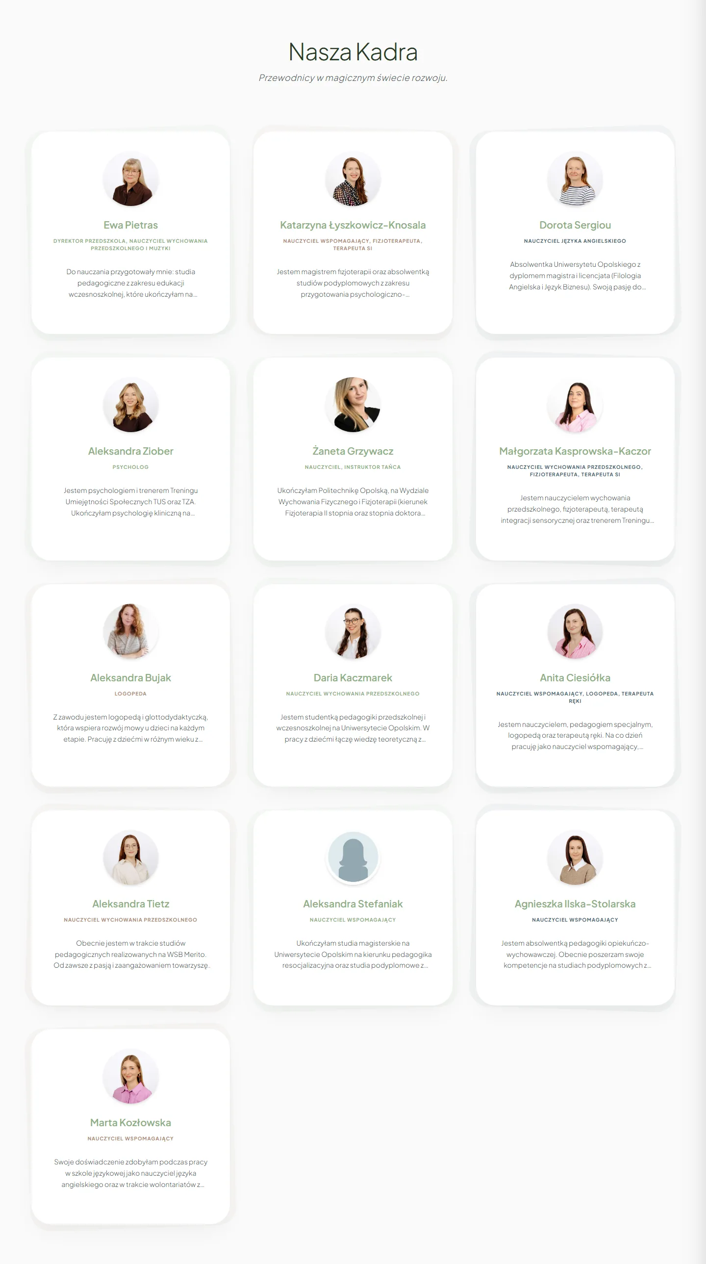
Staff higher up
On the “About us” page I moved the staff higher. For a parent, seeing the people they'll be trusting their child to mattered more than another description of a therapy.
Czarodziejskie Smyczki
I rebuilt the website of Czarodziejskie Smyczki, a music preschool, because the old version didn't show what matters most about the place: the people, the atmosphere and the way the staff work with children.
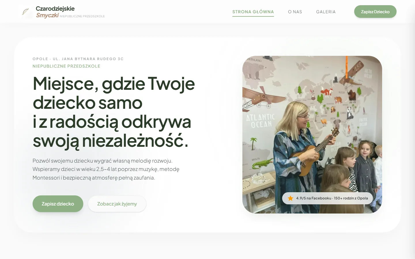
Starting point
I didn't start by asking how to make a prettier interface.
First I wanted to understand what wasn't working in a parent's first contact with the preschool. The old site read like a long document, the contact details were hard to find and the gallery was empty. Parents got information, but they didn't get a clear picture of the place.
Four pairs of full-page screenshots at 1440 px. Pick a page and scroll the frame: you'll go through both versions, from header to footer, at the same scale.

Below a photo with a Montessori slogan, the text just keeps going: the offer, full staff bios, the daily schedule and a list of celebrations. 11,441 px tall.
Open screenshot in a new tab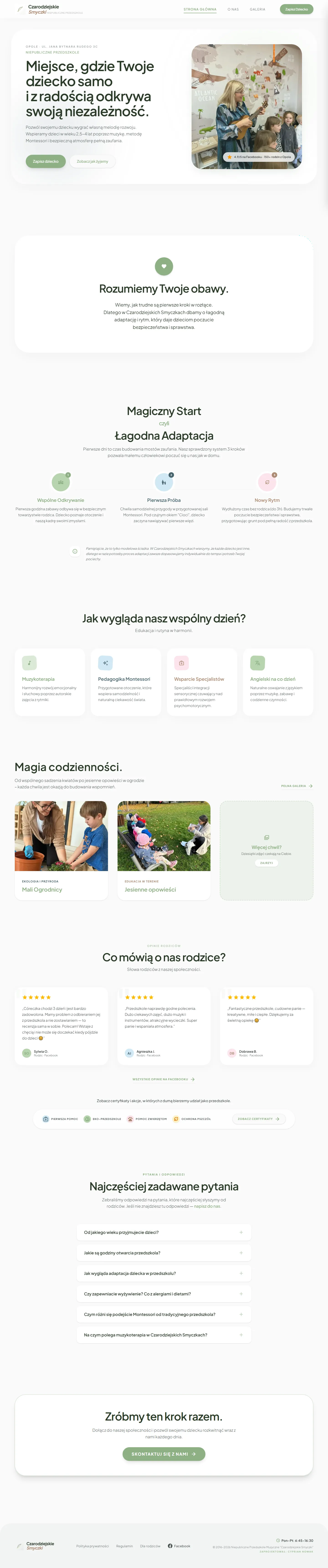
A parent's worries, settling in, a day at the preschool, photos, reviews and questions, each in its own section. 6,880 px at the same width.
Open screenshot in a new tabThe staff bios moved to “About us”, so the home page got shorter without losing any content. What stayed is what helps a parent decide whether they want to get to know the place better.
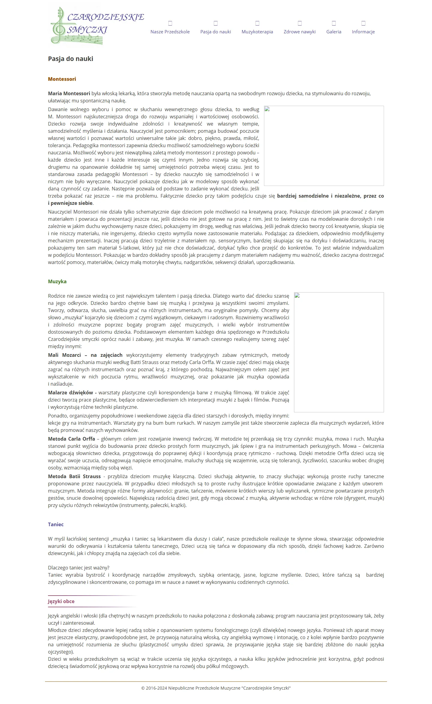
Montessori, music and dance as columns of text. The empty frames on the right are photos the archive didn't keep.
Open screenshot in a new tab
The philosophy in three points, a photo from a classroom, initiatives and certificates, and below them thirteen members of staff.
Open screenshot in a new tabThe old site spread the approach across three pages: Passion for Learning, Music Therapy and Healthy Habits. The new one brings them together in one place, next to the people who put them into practice.
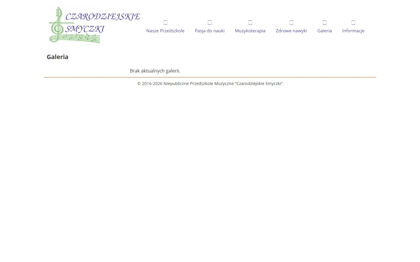
The entire content of the page that was meant to show the preschool.
Open screenshot in a new tab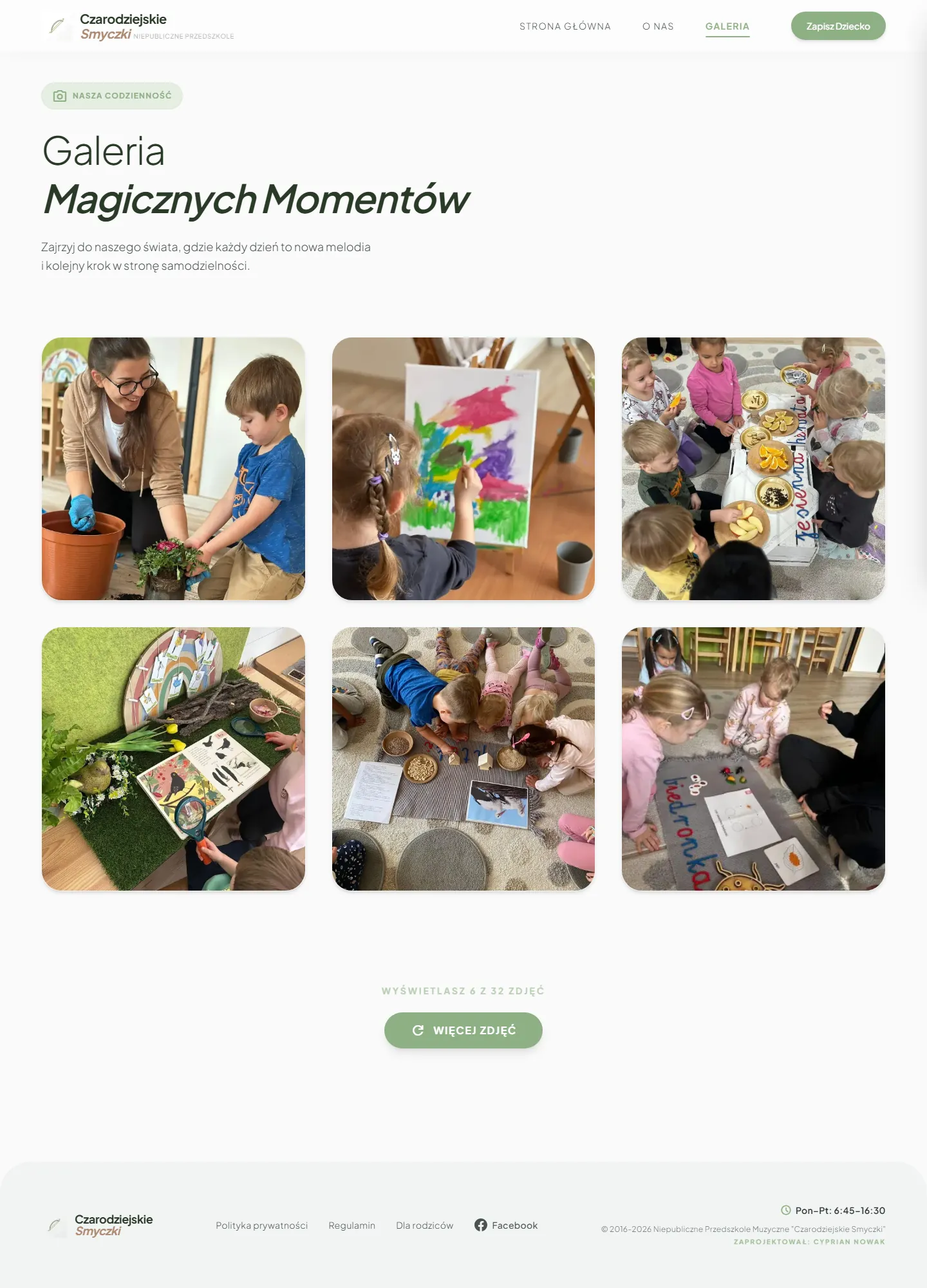
Six to start with and a button that loads more.
Open screenshot in a new tabThe simplest pair in this set and the most tangible result of the project.

The old site had no contact page. Enrollment, the phone number and the application form sat at the bottom of “Information”, below a long series of notices.
Open screenshot in a new tab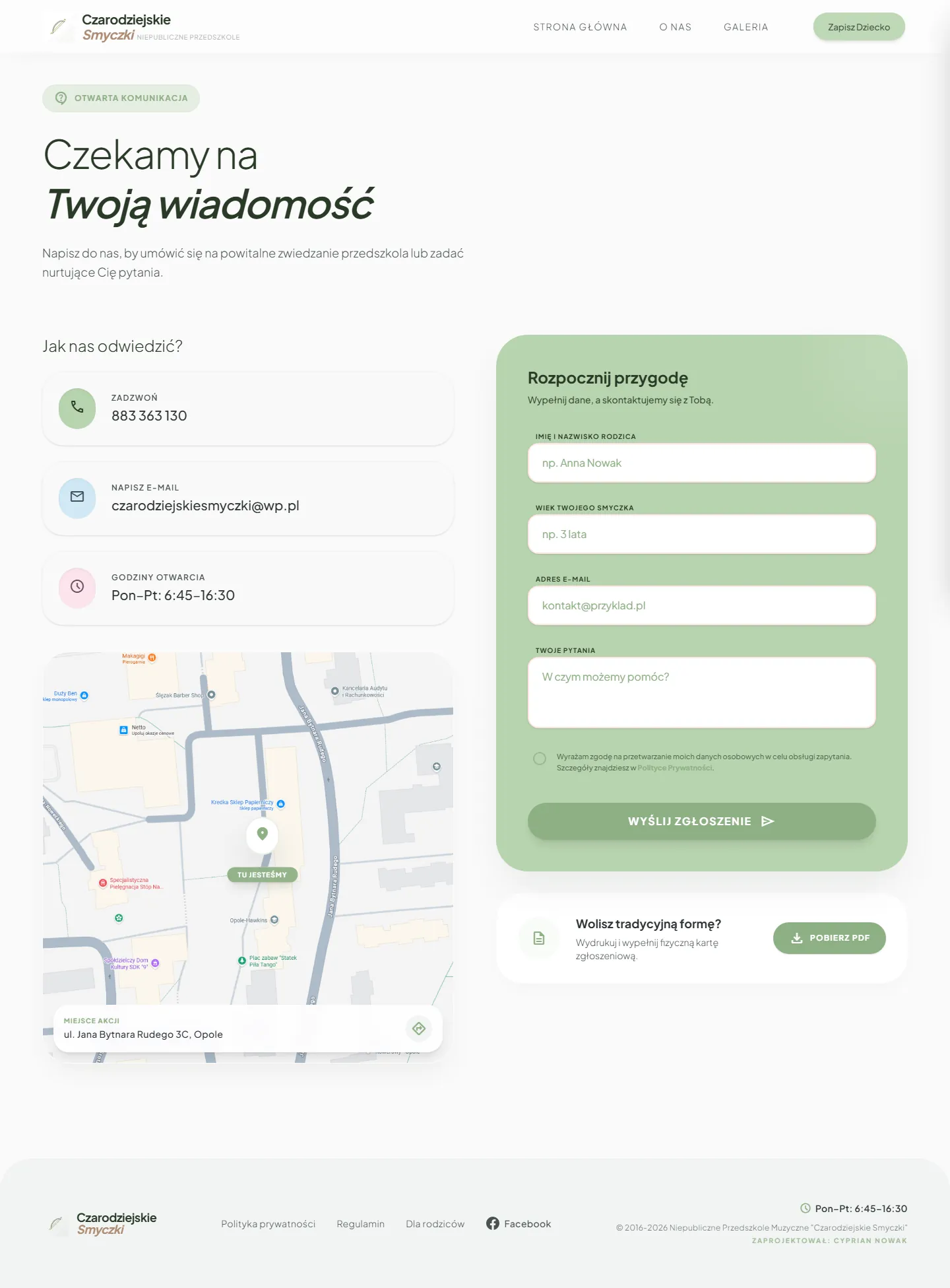
Phone, email and opening hours on the left, the form on the right, and below it a PDF application form to print.
Open screenshot in a new tabA parent doesn't have to look for where to sign up. They only choose how.
About the “before” screenshots. These are the last Web Archive copies from before June 9, 2026. The archive didn't keep the icon font or some of the photos, which is why the menu shows empty squares and the pages show empty frames. It didn't look like that live. I took the “after” screenshots on September 23, 2026 from the working site.
Text first
From NUEVE I took a rule I keep coming back to: a website has to be written first and checked for how well it reads. Only then comes the visual layer.
The Smyczki commission came at a moment when I was practicing this direction anyway. Two weeks earlier I had designed a parent dashboard for a therapy center as a personal exercise, so I had the look ready before the client got in touch. I still wrote the text first, because the text decided which of those patterns made sense for a preschool.
I laid the website out as a calm way of getting to know the preschool.
I didn't want to assume that every parent arrives at the same stage of the decision.
Leads straight to contact.
Lets parents get to know the place and the people first.
The hammer and the smith
I made Smyczki early in my work with AI coding tools. AI sped up the execution, but the diagnosis, the choices and the responsibility were mine.
I was preparing screens for a parent dashboard for children's therapy in Google Stitch and marking on them what stays and what goes.
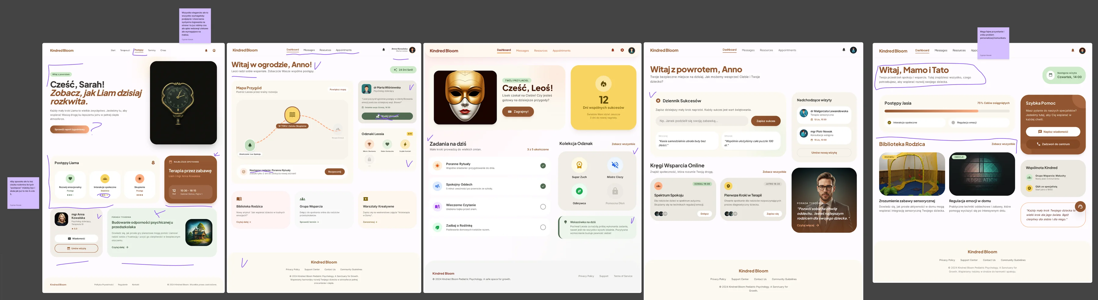
“All very neat, but every bit of this would need wiring up and building a login system for the site, and at that point we're making a kind of web app! interesting but insanely demanding.”
Cost of building it“kinda cool, but also a tough one: how many of these ‘progress’ steps would there be, and the scale, if anything, should go up to 5, not 4.”
Does the scale make sense“Super nice greeting, and the problem of personalizing the message goes away”
The problem this pattern solvesFrom what was left, I designed my own parent dashboard in Figma: two menu states and my own components. It was an exercise nobody but me ever saw. I put in the SensoBaza name as a placeholder, because I had worked with it before.
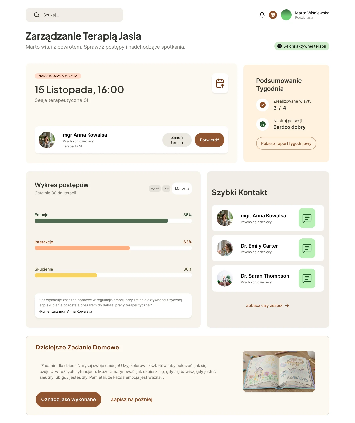
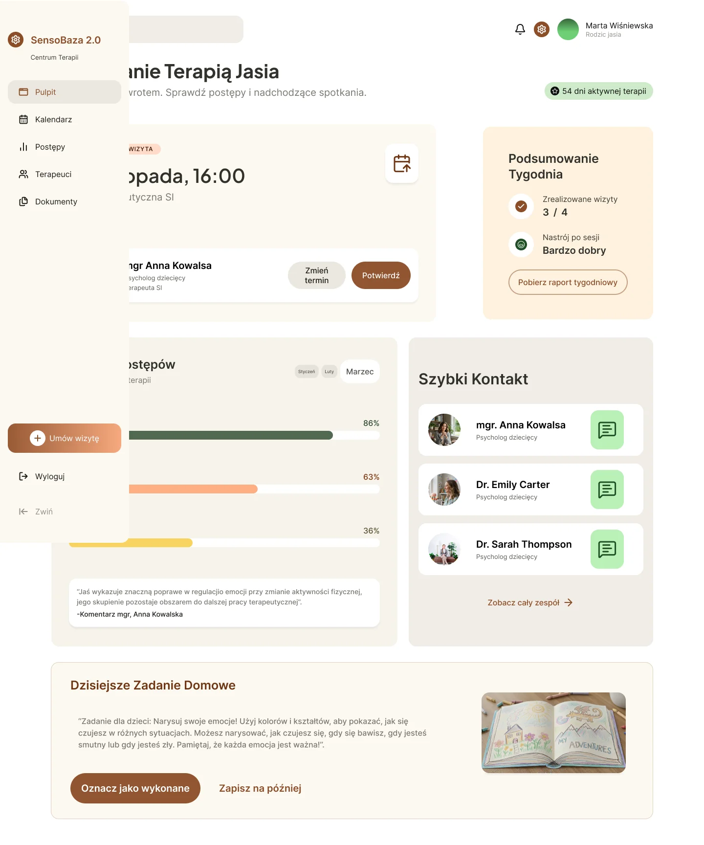
What carried over from the exercise to Smyczki
#925531 in the exercise,
the Smyczki green #8EB085.
I gathered references, wrote the content, laid out the pages and defined the role of each section.
Antigravity helped me turn those decisions into code. When I didn't understand something, I kept asking what we were changing and why.
I ran the project locally, checked how it responded to different screens and came back with fixes. Then came the launch on Cloudflare and more fixes after it went live.
Three decisions
On the “About us” page I moved the staff higher. For a parent, seeing the people they'll be trusting their child to mattered more than another description of a therapy.
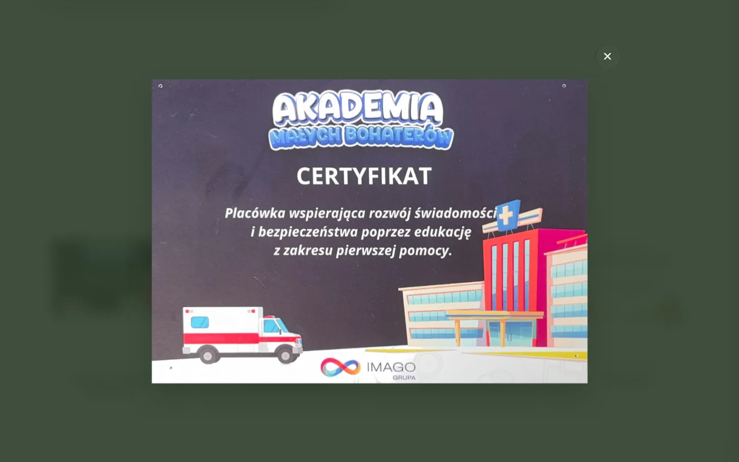
At Ms. Ewa's suggestion I added four certificates in a light gallery with a zoom view. They aren't staff diplomas but traces of initiatives the preschool takes part in: first aid, environmental protection, helping animals. They were meant to make the place feel real and show its character, not to be a document archive.
Below the online form I added a PDF application form that I designed myself. The digital form doesn't have to be the only way. A parent who prefers paper can download the document and fill it in at their own pace.
Result
Today Smyczki has real photos, visible staff, a clear description of its approach and short paths to contact.
The most tangible result is simpler: instead of an empty gallery there's a real picture of the preschool, and a parent can understand faster who they're trusting their child to and what to do next.
The websites he created for Czarodziejskie Smyczki and SensoBaza are beautiful, modern and clear, and above all they work very well in practice. Parents find the information they need without any trouble, and we have heard very positive feedback about their look and functionality many times.
Ewa Pietras, director of the Czarodziejskie Smyczki preschool (translated from Polish)
I don't present Search Console data as a result. Clicks from Google went up at the beginning of May 2026, a month before the new website launched, and there's no jump around June 9.
The website also has no Analytics, so traffic can't be linked to enrollments. That's why the most important evidence is the client's own words, not another chart.
Working together
Before the paid rebuild of Smyczki, I designed SensoBaza for the same owner. In 2026 I went back to that project, redesigned it completely and moved the static site from Webflow to Astro 7 to cut an unnecessary running cost.
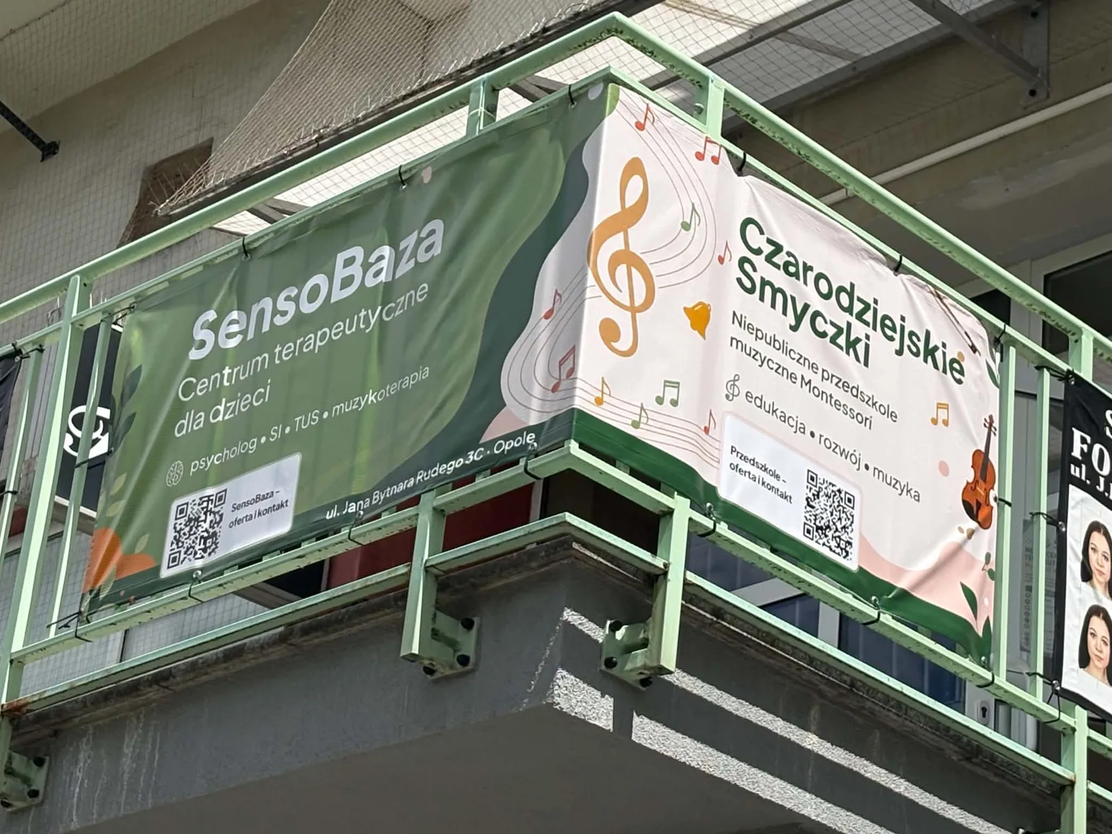
SensoBaza has its own case study because it solves a different problem: I went back to my own work and assessed it anew, built a visual system and planned the migration so as not to risk the existing addresses or the rankings the site had already earned. The new version is already live at the client's address. The two projects share a client and printed materials, but each has its own story.
Takeaway
Smyczki was my first paid project. A year earlier, with the first version of SensoBaza, I went through a similar path, from first ideas and conversations with the client to launch. But that was for free, and expectations are usually lower then. Here I knew from the start that the work was paid, so I had to deal with time pressure and agreements I had to keep.
The technology changed too. I built the first version of SensoBaza in Webflow, and Smyczki in code, using AI coding tools. I deployed it on Cloudflare and connected the form. Those were my first steps with code.